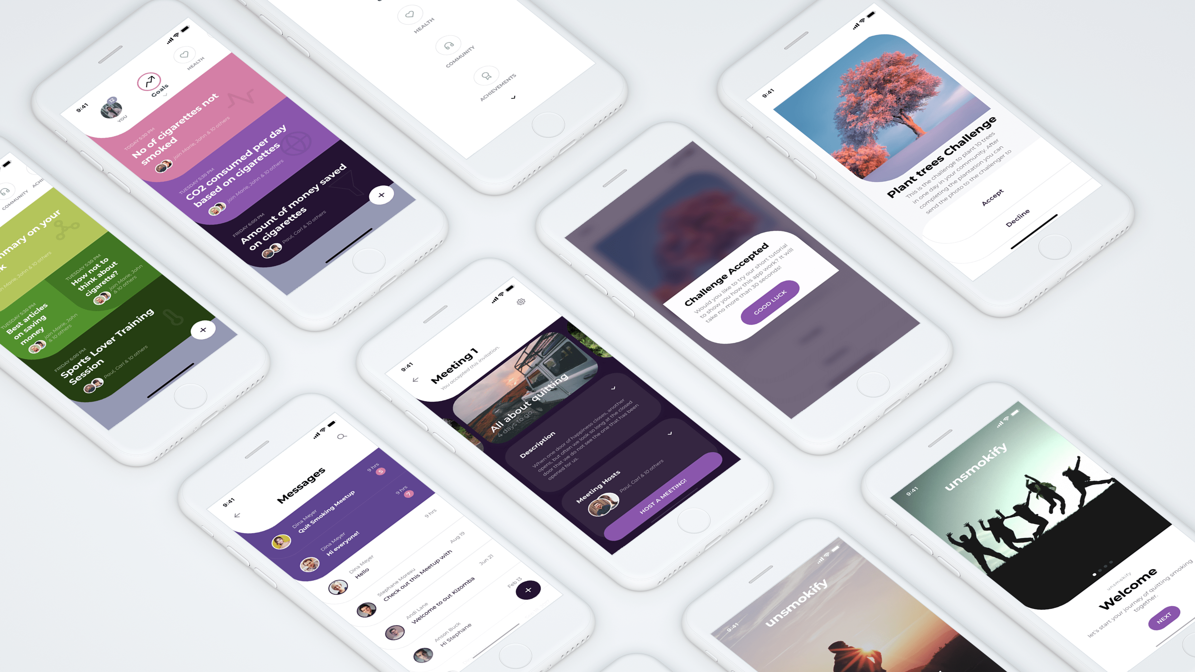
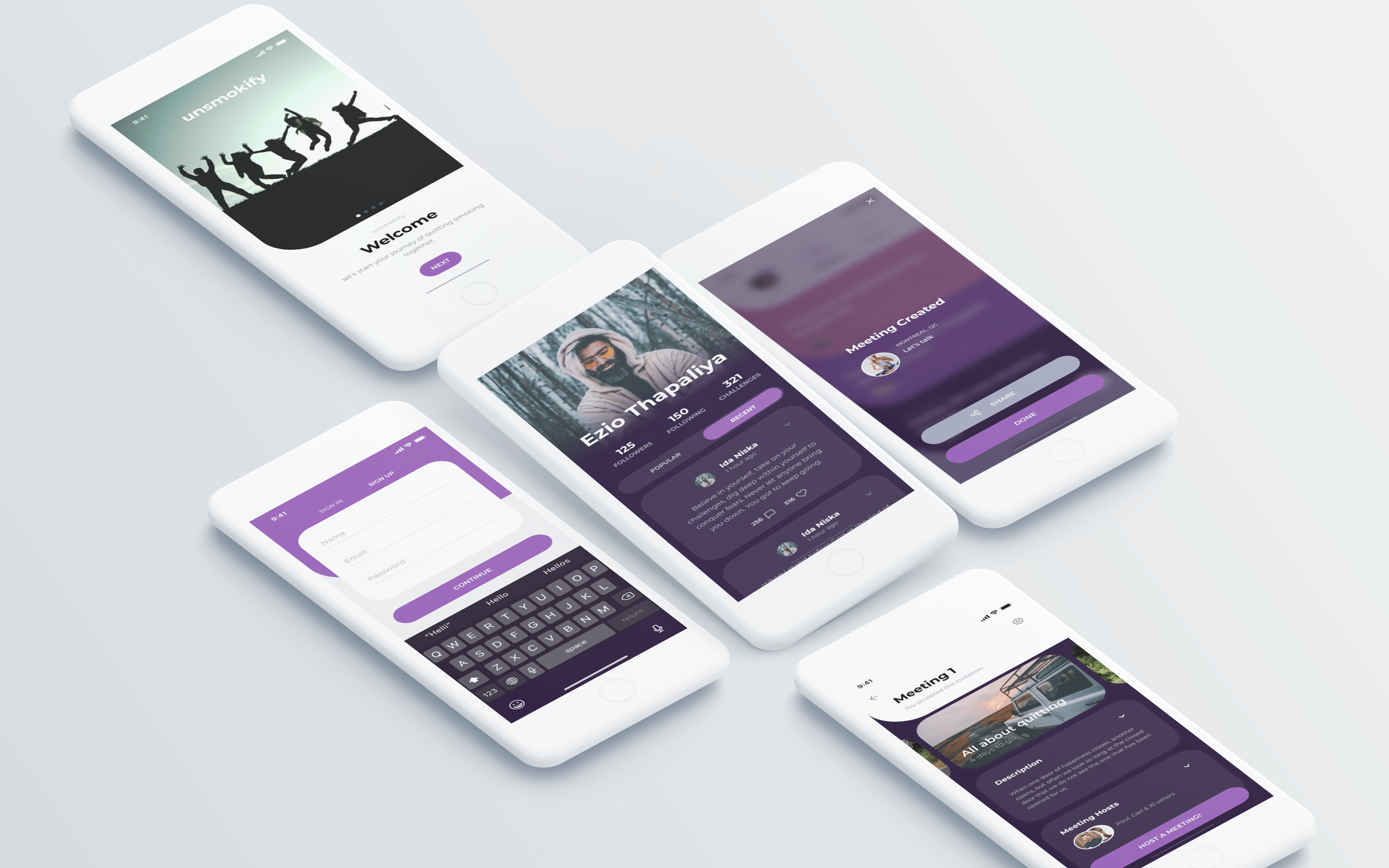
Unsmokify: Case Study


Integrating UX Research and UX Design to create a great product through understanding user needs, rapidly generating prototypes, and evaluating design concepts. Also hands-on experience with taking a product from initial concept, through user research, ideation and refinement, formal analysis, prototyping, and user testing, applying perspectives and methods to ensure a great user experience at every step.
The Ultimate Goal
The purpose of the study is to evaluate:
First some research,
Here’s how the empathy map for Yael was filled out.
Defining the problem further,
App Description
It helps to choose the approach that works best for you — going cold turkey or slowly decreasing your nicotine intake — and tracing your cigarette consumption and your cravings for proof that you really are making progress. The app’s built-in community is a great place for inspiration and support from other people trying to quit. You also have the option of participating in a several environmentally friendly events that the app will notify you. Also, complete challenges, get achievements and enjoy the gamification process. The app will allow you to host meetings and also get notified about the meetings created by your common friends who uses the app.
Competitors
Every other apps and even websites that has claimed to make the user healthy and free of smoking.
Some examples of these competitors are described below:
Lo-fi Prototype
Here are few of the lowfi prototype I created based on my primary research, storyboard and competitors.
To begin the process of creating digital wireframes, I pulled out my original paper wireframes and my research. I studied these
materials to remind myself where I had decided to place my elements, and why. Next, I opened Figma and started a new project file.
Then, I uploaded pictures of the paper wireframes into Figma to use them as a reference. Once the paper wireframes were uploaded, I
created frames for the device I was designing for. Once I had the correct number of frames for my design, I added a layout grid to
keep everything lined up accurately.
Then, it was time to design. I began to create each of the elements in my paper wireframes. I
started with buttons and icons. I pulled basic icons from free asset libraries, and used shapes, lines, and fills to create the
remaining elements. After all of our elements were created, I began to place them into the design. I followed my paper wireframes as a
model to make sure that I am aligning my digital wireframe with my previous design iterations and the insights I uncovered in my research.
My design uses a hierarchy of information, bringing the most important information to the forefront. The importance of the information
was based on the research I had completed earlier in the design cycle.
High Level Goals (first test)
The intention of the study was two fold:
Recruitment Criteria
The demographic of the person who took an interest in our study is delineated beneath. Data about members'
sexual orientation, age, methods preferred to quit smoking and desirability to use the app was amassed from
our session of pre-test questionnaire.
Gender: 2 males, 3 females
Age: 23 (Average)
Previously Used Apps: My Quit & Cessation
Test Environment (first test)
My study was conducted on April 18th, 2019in my room, located on the Dudelange, Luxembourg. The session was conducted in person, with the participants and I being a moderator, and note-taker. Working in a private space mitigates participant disruptions while reducing the amount of background noise in our session videos (everyone was required to record their screen while navigating through the wire frames). I offered some chocolates to ensure relaxation for our participants.
Session Format (first test)
The participants had to use Think Aloud protocol to complete four tasks that evaluated the use of wire frame. In addition, all participants were asked to fill out a pre and post-test questionnaire(standard SUS questions). Every session was monitored also in Canon Camera, allowing us to examine the sessions later, to read the body language of the participants, review the steps taken to complete every task, and extract interesting clips and quotes.
Analysis of User Needs
Competitive Analysis
Functional Requirements
Constraints
Design Goals
The goal of the design is to make people love the app and keep engaged on the app so that they will progress in their
journey of quitting to smoke. It focuses on the user needs and also is inspired from their current practices. This will
indeed make the design very user friendly and keep the user away from the smoking world which is basically the ultimate
goal, thus it isvery important that the design goal and the ultimate goal connects.What I wanted to transmit in the
app was something completely different from what the competitors are doing out there. After talking with a small
sample size, I found out they were not very happy with the normal way of use of the quitting apps.I used this
feedback to define my key features.
Hi-fi Prototype
I validated my low-fi and mi-fi prototypes and now I started working in the hi-fi wireframes.
I will consider all the feedback gathered from the different rounds of testing.

Final Usability Test
The intention of the test was to see if the design goals was met or not and to find the problems with wire-frames when they will interact with, in order to complete a specific task.
Recruitment Criteria (final test)
The demographic of the person who took an interest in our study is delineated beneath. Data about members'
sexual orientation, age, methods preferred to quit smoking and desirability to use the app was amassed from
our session of pre-test questionnaire.
Gender: 2 males, 2 females
Age: 21 (Average)
Previously Used Apps: Stay fit, Smoke free Go Green
Interview protocol
The protocol is categorized as in the following way, first the overarching questions, then list of questionnaires and how will the actual interview start.
Overarching Question
Will you use the app that will help you to quit smoking totally?
Introduction
Hi, my name is Ezio Thapaliya, and I’m here to understand what do you think about the app that helps you to quit smoking.
This interview will take about 30-50 minutes, during which time we’ll go through some questions.
Throughout, I’d like you to treat me as if you’re describing the situation to someone who isn’t familiar with windows' automatic updates. I’m here to learn from you.
A couple of things before we start. To the extent possible, I will take your comments to be confidential.
The answers you give in this interview will be used for research purposes. All the data will be securely stored and used only for the present research,
in accordance with the ethical guidelines defined by the US law. All information will be handled anonymously and in a confidential manner by the researchers,
the results can only be published anonymously. If we quote you in our final report, we will do so without identifying your name or specific role.
Also, this interview is entirely voluntary on your part – if for any reason you want to stop, please let me know.
You can withdraw at any time or refuse to answer any question without any consequences of any kind. No answer is wrong and all will contribute to the project.
Do you have any questions for me? All right, then, let’s proceed. [Once the interview gets underway...]
Oh, and by the way, do you mind if I take an audio recording? This is just so that I don’t miss anything – no
one other than the research team will have access to the recording. Thanks.
Warmup
How often do you smoke?
Questions
Test Environment (final test)
My study was conducted on April 19th, 2019in my room, located on the Dudelange, Luxembourg. The session was conducted in person, with the participants and I being a moderator, and note-taker. Working in a private space mitigates participant disruptions while reducing the amount of background noise in our session videos (everyone was required to record their screen while navigating through the wire frames). I offered some chocolates to ensure relaxation for our participants.
Session Format (final test)
The participants had to use Think Aloud protocol to complete four tasks that evaluated the use of wire frame. In addition, all participants were asked to fill out a pre and post-test questionnaire(standard SUS questions). Every session was monitored also in Canon Camera, allowing us to examine the sessions later, to read the body language of the participants, review the steps taken to complete every task, and extract interesting clips and quotes.
Tasks
During the usability test, participant was asked to complete four tasks. The table below provides a rundown of the activities.
Finding and Responses
All the tasks were successfully completed by all the participants. They loved the design and were happy with the whole process and were pretty excited to use the app in the real word as soon as they could.
Although the responses were pretty good, there were some flaws and requests by the user. The flaws and requests were the following:
Next Steps
The next step would be work on the user feedback, and after that make the user research in a large scale. This would help the app to be more improved and better before releasing on the real world. After completing the research in large scale and refining the app, we can hire developers to start working on it.