Project Background
As a UI/UX Design Lead on the NDB Design team, one of my projects was to lead the redesigning of NDB brand and the website.
The redesign is for the next big launch of NDB which aims to attract investors and users from all around the world for
their upcoming biggest product, a nanodiamond sustainable battery that can last for a very long amount of time.
It was an incredible experience working closely with a global team of designers, marketing experts, and stakeholders
to hit one primary business objective and key results. The impact of my design decisions allows NDB to stay competitive
in the market, attract more investors and increase traffic and make users stay on the website for a longer amount of time.


Problem: Why a redesign?
NDB, Inc. is a Silicon Valley-based nanotechnology company that was established for the development and manufacturing of
semiconductor chipset, battery solutions, and energy propulsion systems.
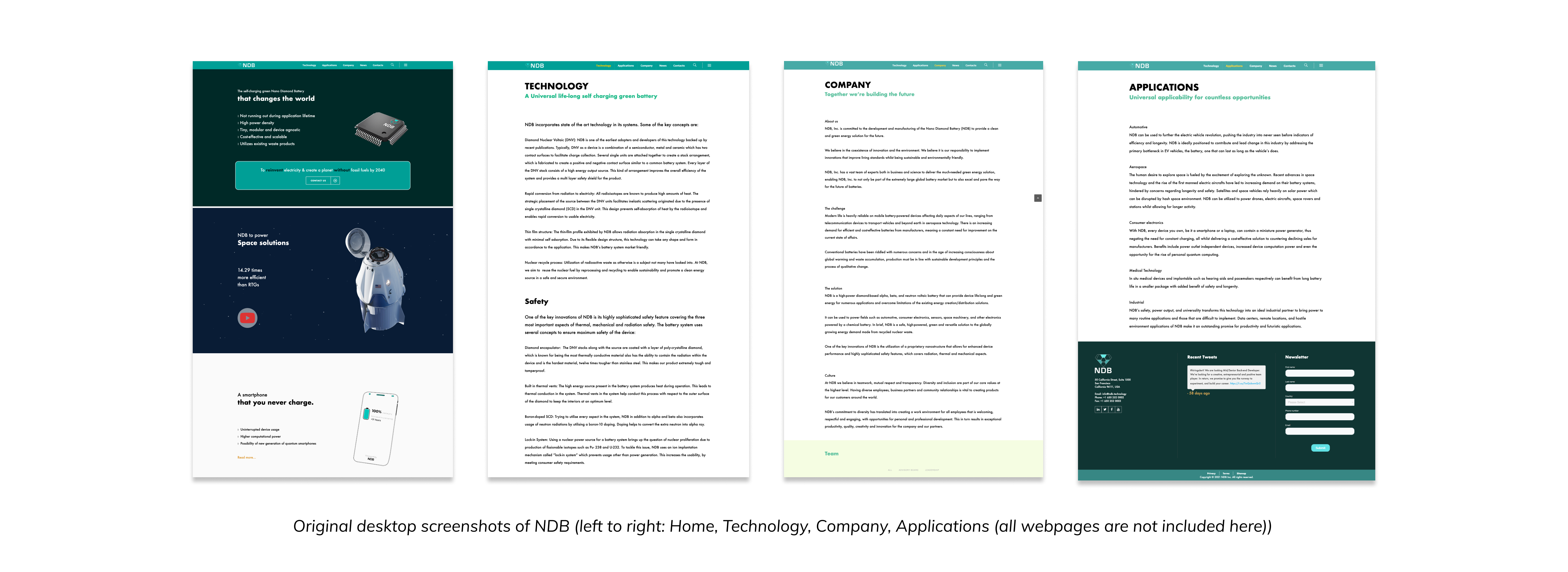
NDB identified that the current website was not able to communicate about NDB, what it does, and who it is, neither to investors
nor to customers. The current website was more like a document with a lot of technical words without any proper aesthetic,
design, and flow.
Rebranding NDB
NDB’s Marketing Team and Design Team (two of our design team members) were also rebranding the style guide at this time.
Because I was working on the flagship site for a worldwide market, I was in the loop for new branding updates and brought
them back into my localization project. In this case study, I'll be listing the design thinking behind the page designs and
design components.
Look & Feel of the Website
Design process has it's methods, and one of them is the look and feel phase, in which the product (our website) will gain its style.
During creating a look and feel design, we displayed a visual representation of the mood of the interface before actually working out the details.
This is just one part of the whole design process, based on exploration and discovery.
Preparation
So to start the look and feel of the process, first, we needed to talk. Yes, this very visual design work started with talking.
A lot of it. Creating the best design mood requires this, so this way we could clarify what we wish to achieve. The easiest and
most effective way to do this was organizing a few-hour-long meeting, during which we can talk through the design in great detail.
It was crucial that each and every team member and stakeholders were present as stakeholders had the most thorough knowledge about
the website’s overall idea and the target group.
Inspiration & Research
Now, we started with some research. It was necessary to find material that fits what has previously been discussed and can be a
source of inspiration for designing the interfaces. Rival websites, other software interfaces, design trends, for example, could
all serve as resources for the look and feels. It was useful to walk with eyes wide open, collecting plans for our interface,
elements of user interfaces (buttons, form elements, menus, etc.), font types, icons, and photos. For all these, we created
a mood board.
Deciding the look and feel
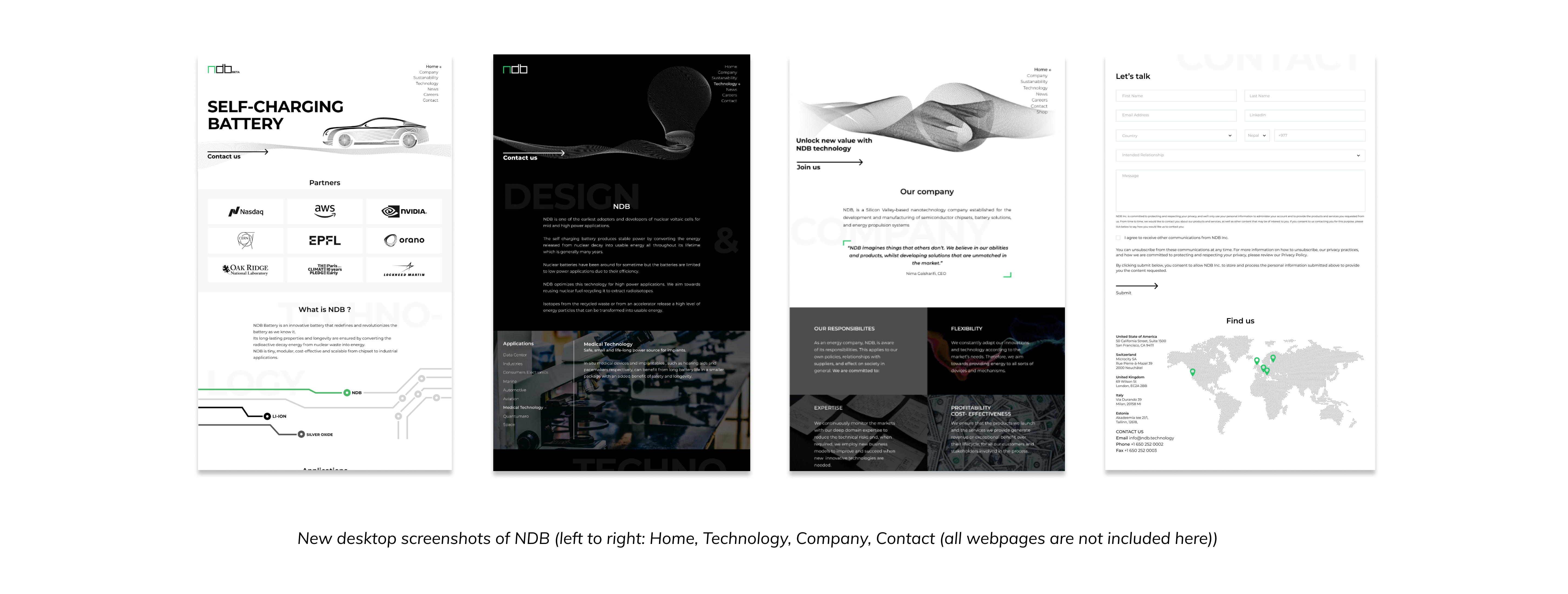
After being done with the research, we chose a typical screen that served as the homepage of our website. We created a bunch
of colorful sketches for this screen, all with a slightly different atmosphere. In the period of gaining inspiration, we got closer
to the desired character.
Each version of the look and feel designs differed in color, shapes, font types, and icons. Also, we created at least one dark
and one light design as well, so the stakeholders can decide easily which kind of look they want to have for the website.
Other Design Components

Feedback and Review
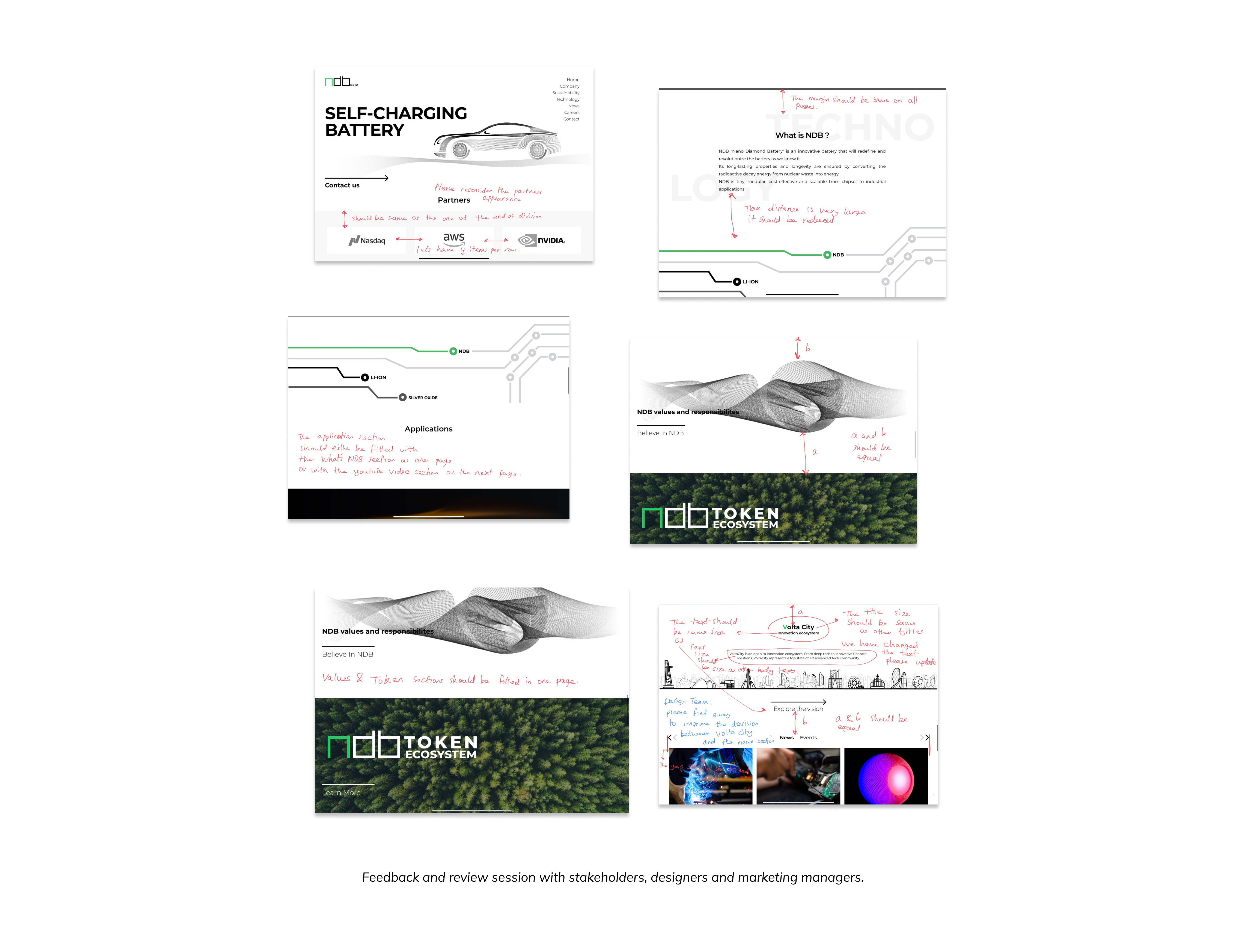
As the design lead for the project, I worked incredibly closely with the stakeholders and the Marketing Team to design and
successfully deploy a completely new website in a 12-week design sprint and 8-week engineering sprint. Since we were all working
remotely, I had an everyday meeting at the end of the day with the Marketing Team for the content and one meeting at the end of
the week with stakeholders where we reviewed weekly progress across all the pages we were designing. There were many synchronous
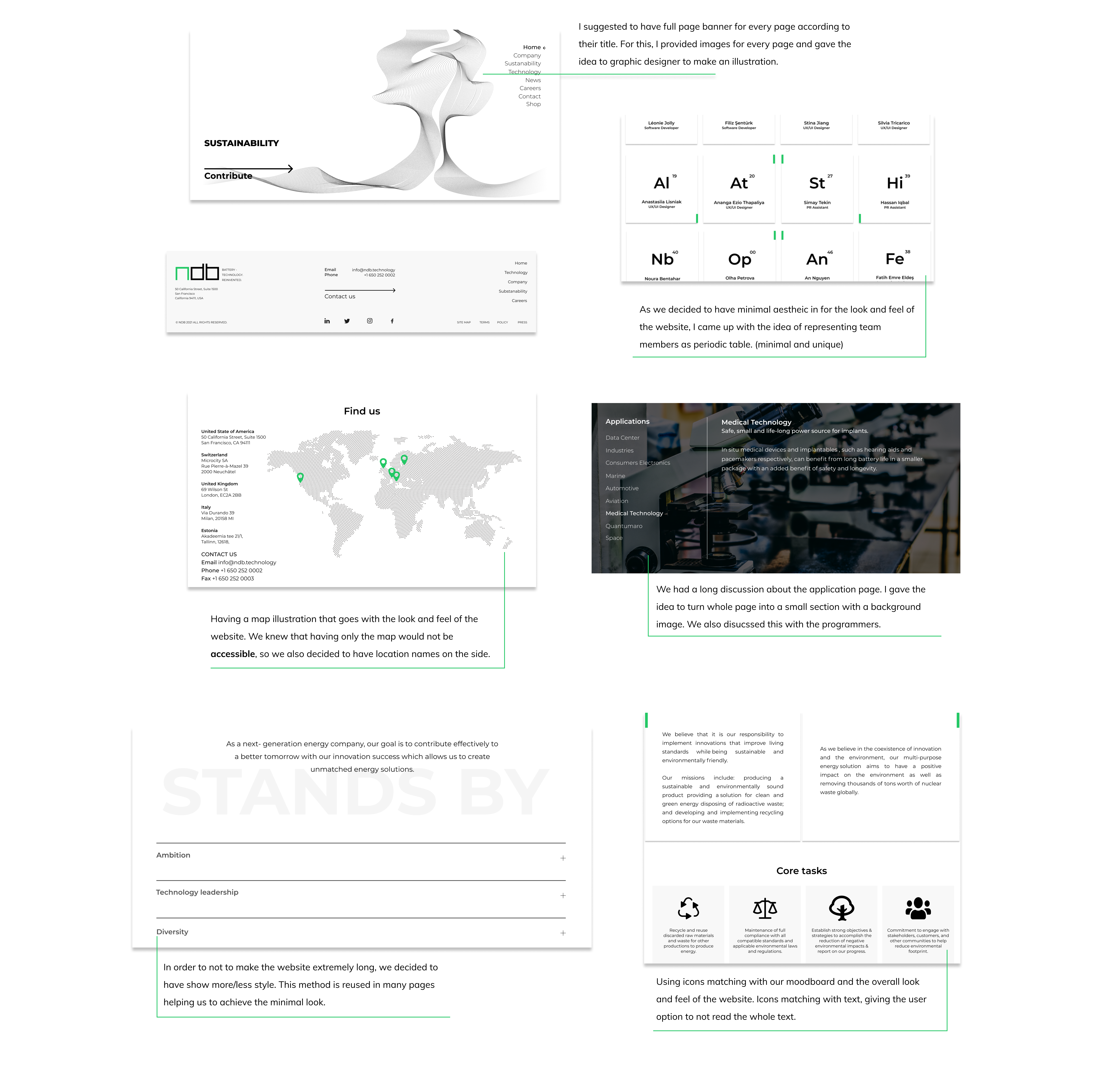
tasks each week, including but not limited to creating illustrations for each banner, icon reiterations, atomic design updates,
and modification of the content. We used a shared spreadsheet to document progress and over 200 tasks for the Designers,
Marketing Team, and Content Reviewers.

As the design lead driving the design decisions of this project, I was responsible for delivering updated Figma artboards to
NDB and checking-off delegated tasks on Trello. All the team members were very supportive to help with my onboarding to the big project,
and often provided feedback on my design iterations!
Conclusion and Reflection
It was an amazing learning experience to design a website for the world market, and I'm grateful for my NDB in trusting me
with such a global project. Working directly with stakeholders and marketing teams taught me the direct correlation
between user design and successful metrics. Communicating with my stakeholders, backend, and frontend engineers guided me in creating
optimized designs that were technically feasible to develop. It's still surreal for me to see my journey, growth, and hard work
on the updated site!
The site will is publicly avaialbe at ndb.technology.