As the sole product designer, I redesigned Kompyte's user experience by conducting a thorough analysis and strategically redesigning the visual aesthetics and interface. The results created user-centered designs that achieve tangible business outcomes, including a 68% reduction in task completion times and a 139% increase in user satisfaction ratings.
Background
Kompyte is a competitive intelligence software focused on enabling go-to-market teams with the insights they need to overcome the competition. Using machine learning AI, Kompyte collects, analyzes, and organizes data to help teams generate and share actionable insights. With fully automated workflows and easy-to-use architecture. Kompyte makes it easy for multiple teams to seamlessly respond to rapidly evolving market dynamics.
I support design across every aspect of our business and am responsible for leading UX and UI across key parts of the application side of the platform.
Implemented a design process: This has helped our team establish more structure to how we conduct our work and allow other teams to gain visibility across our upcoming sprints.
Improved usability across the platform: No usability tests were conducted by the external consultancy before dev handoff. I have been actively working towards conducting UX research and usability testing on all projects.
Establishing a design kit: This has helped to maintain consistency in the look and feel across different parts of the platform.
Establishing a design system: This has helped the Engineering and Product teams to understand how and why we choose to implement certain components over others.
Problem space
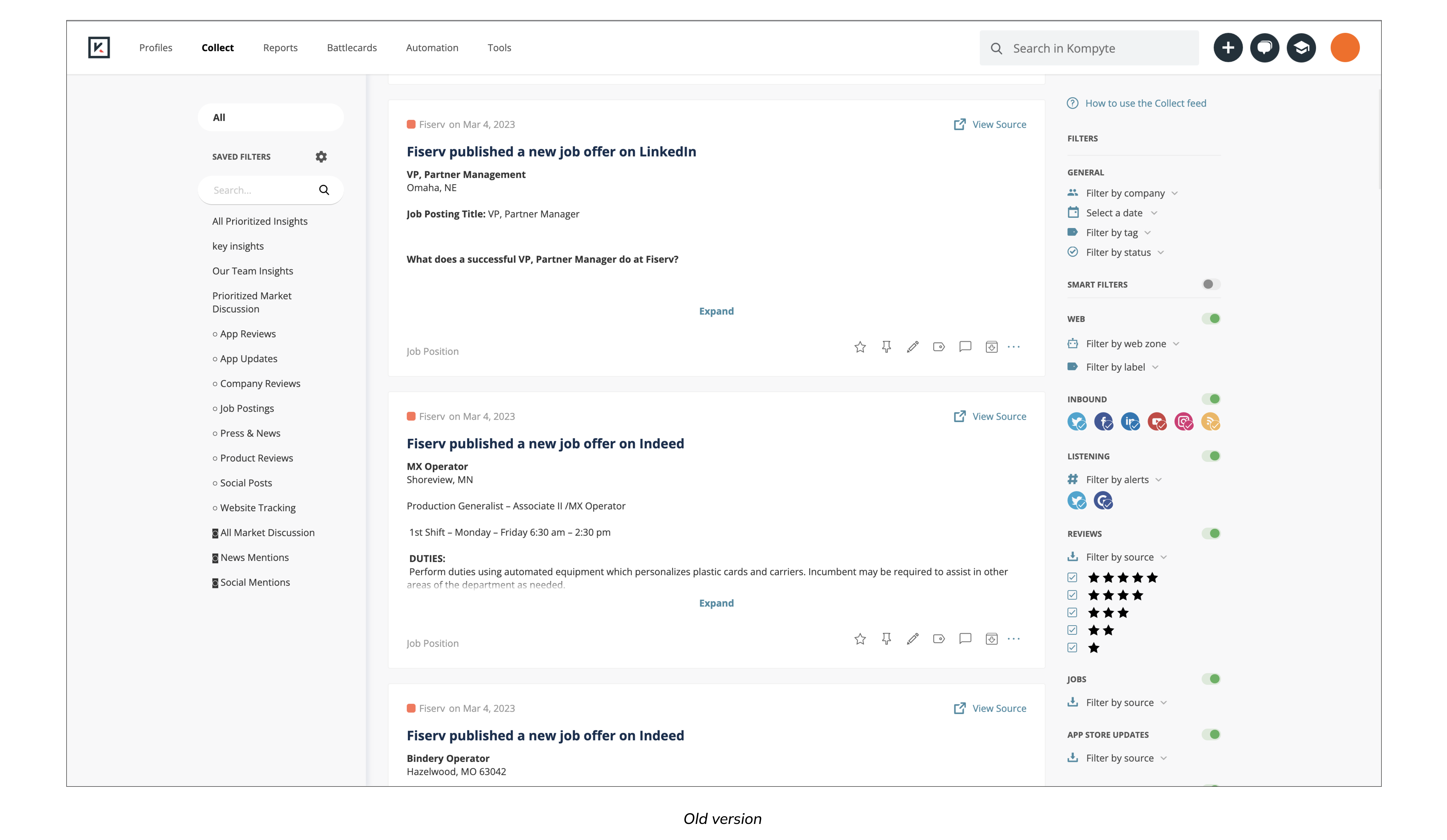
Before Kompyte even hired a product design team, a release of the platform had been implemented based on designs executed by an external consultancy. These mockups were created without any usability testing and had little consideration for the technical and product limitations on the scope of work. I conducted research interviews with our primary users (sales and marketing managers) to uncover any pain points that they were experiencing with the release.
With faster releases, comes greater design challenges!
Due to time constraints, our enginners had to do quick deployment and releases with the compromise of UX. However, after I did some quick usability testings, I discovered some key usability issues and and pain points by understanding the user goals & needs and analyzing the existing user journey.
Pain points and challenges
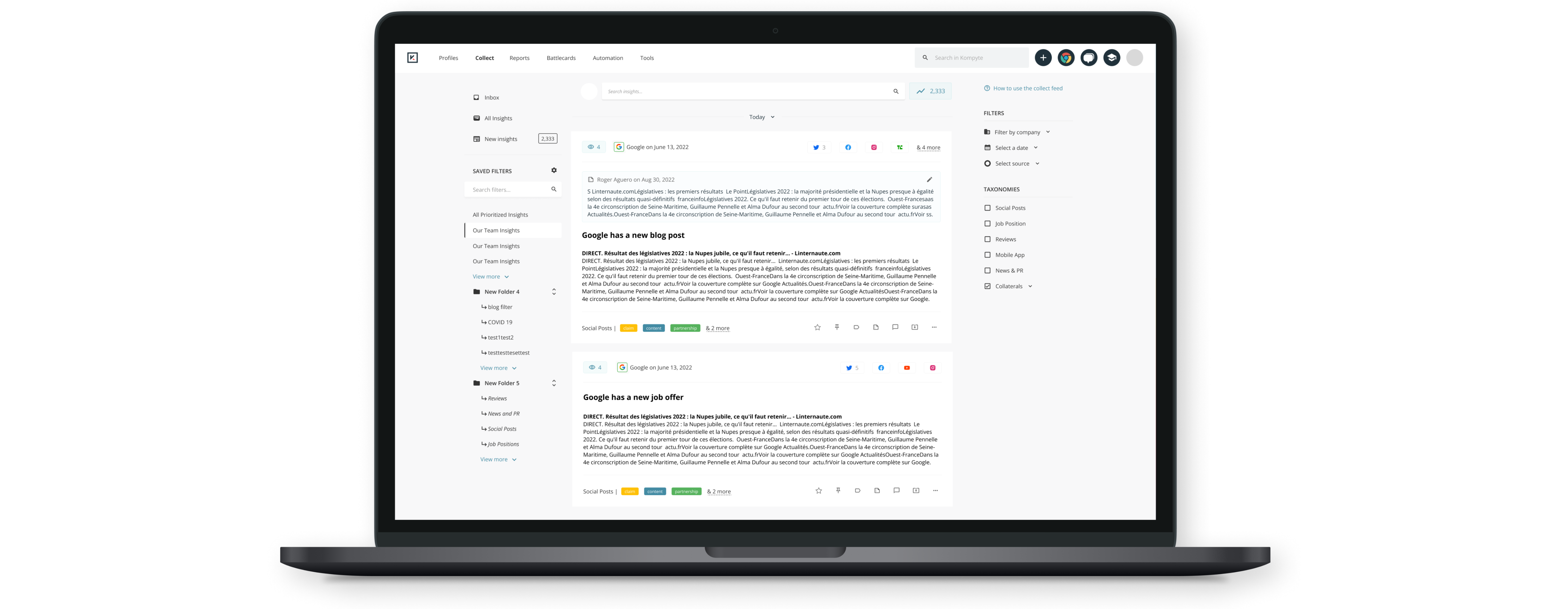
Users are frustrated with duplicated amount of insights in the collect feed.
Users are confused about the filters, they are not sure how it works.
Users need more easy and powerful way to search, currently search is not used at all.
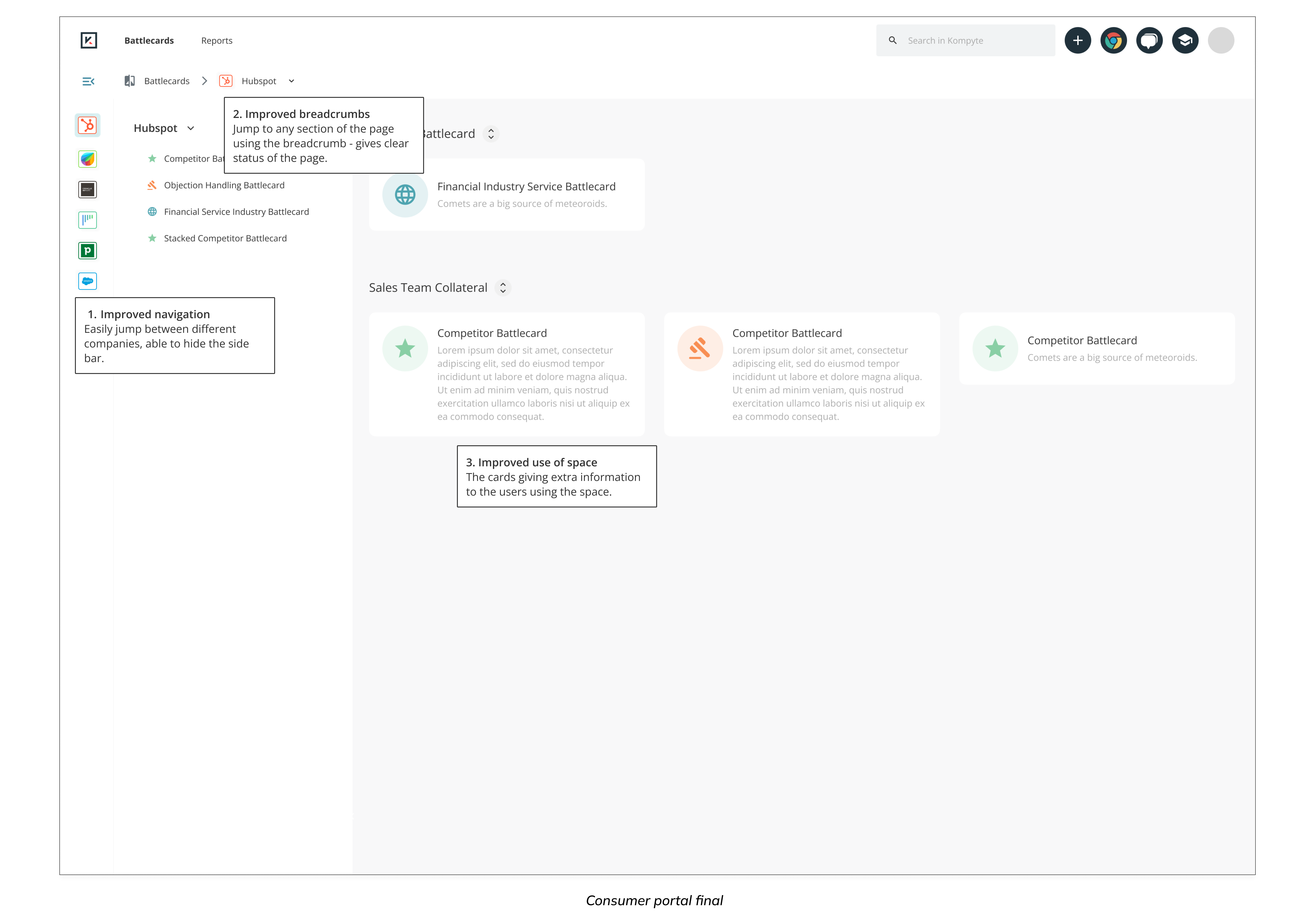
Not enough information from consumer portal, and lot of wasted space.
Now here comes the design challenges.
How might we communicate required information in consumer cards?
How might we empower users to use filters and search efficiently?
How might we inform users of different states of the insights?
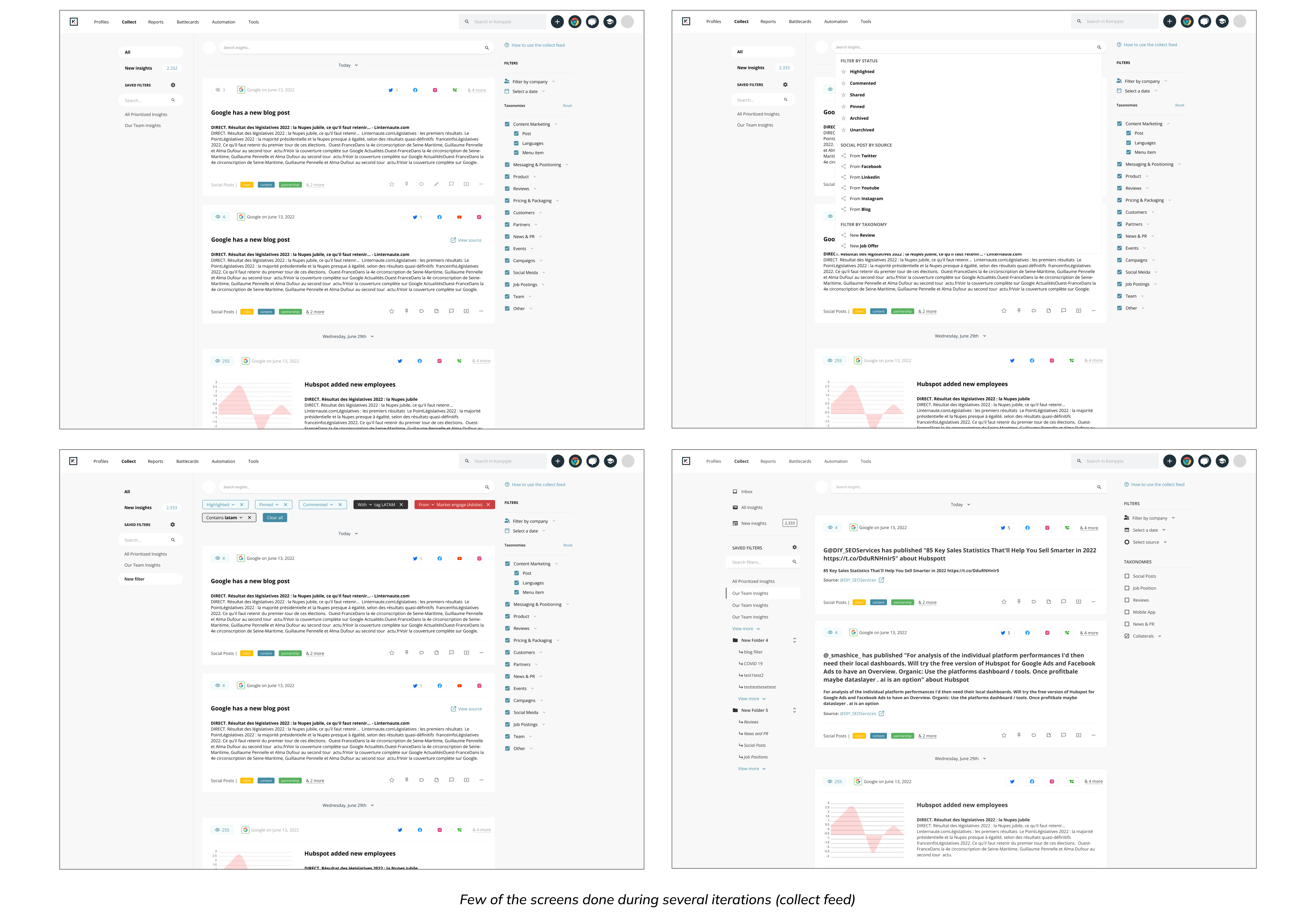
Brainstorming & Faster Iterations
Through an interactive design process, I was quickly moving between paper and digital prototyping, testing prototypes with users, and getting feedback from my mentor and internal sales executives. From each iteration, I learned something valuable. Some helped me make small usability improvements, some helped me make major changes in my design direction.
Before starting designing, I drilled down the features that my design should reflect to solve the painpoints.
Smart trait updates
Seen/unseen status
Rolling dates
Folders & reorder options
Reduce the amount of time needed to curate intel (by grouping Cross-Channel Insights)
Extra information from cards for consumer layout
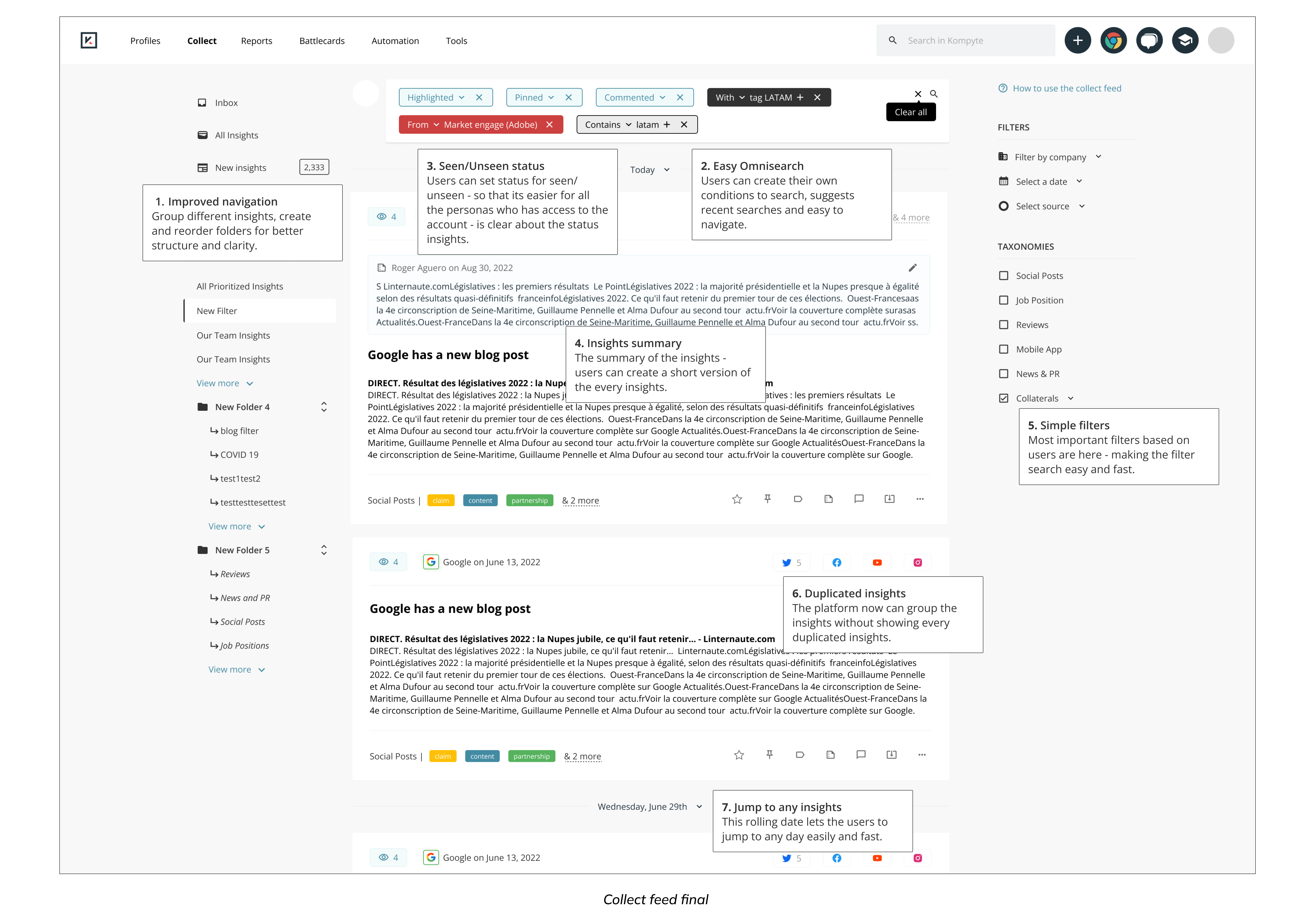
Design Decisions
The following results were achieved:
High efficiency of use: Users can see all the key info at a glance without digging deep into the platform.
High visibility of system status: Users are informed where they are in the page, using improved breadcrumbs, seen/unseen status.
Improved navigation and filter: Simple filter and the menu allows to restrucutre different insights into different categories and users can group insights into folders.
Validating the design
I conducted usability testing sessions with our primary users to validate whether the new designs would solve their problems. I wrote a script including different scenarios to test whether we solved all the pain points obeserved at the beginning or not. During the session, I observed how they interacted with the prototype. The usability session revealed that it easier to navigate through the platform and I was able to solve the key usability issues found at the beginning.
The changes I made were received positively from users. I also did two usability testings to gauge the effectiveness of the new design.
With the original design, the set of tasks took 19 minutes. With the new design, the set of tasks took 6 minutes. Nearly 68%.
Users' subjective satisfaction with the new design (4.3/5) was 139% higher than the original design (1.8/5).
Developing the designs
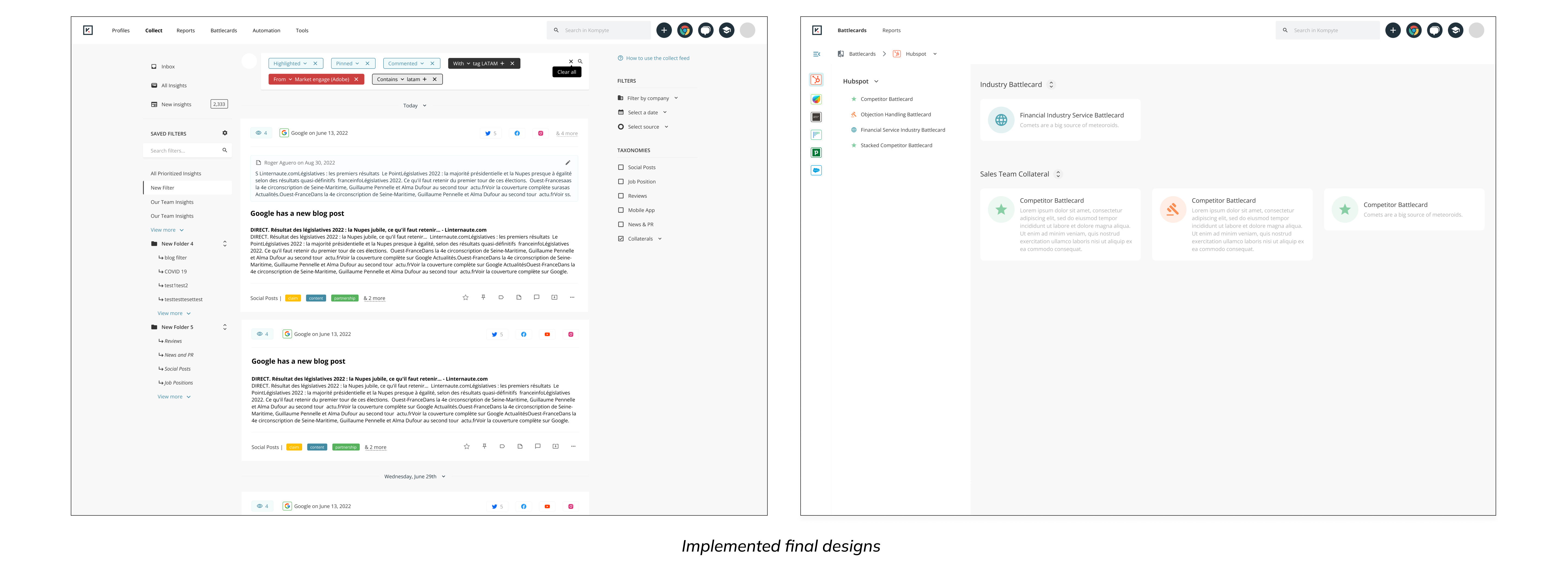
I created my high fidelity mockups in Figma to allow the engineers to inspect the file and export the HTML and CSS code. I worked very closely with the Front End team to spec out any missing interactions that were not covered in the high fidelity mockups. I conducted a UX review of each front-end ticket that was implemented to ensure it was aligned with the designs before it went live.
Results & takeaways
Since the implementation of the new rebuild collect feed and consumer portal, we have seen a significant decrease in the number of complaints lodged through the service desk. Additionally, I have received positive feedback from users about the simplified configuration of their insigts, saving them a large proportion of their time.
Some key takeaways from this project are:
Create a strategic plan to launch an MVP: This helps deal with out-of-scope requests that could potentially derail the project and helps deliver a quality product in time.
User testing doesn't end after development: Design is a constant iteration of improving the experience for the end user. Always find ways to collect and listen to your user's feedback.
Involve engineering upfront: This helps to reduce any rework later on as an understanding of the technical limitations upfront will help to inform your design strategy.
The biggest challenge for this project was navigating the problem space. As the sole designer, the task of “building a design system” sounded so daunting at first compared to how comprehensive and complicated the iOS design system or the Google Material Design system are. I am glad my design hit the bar.