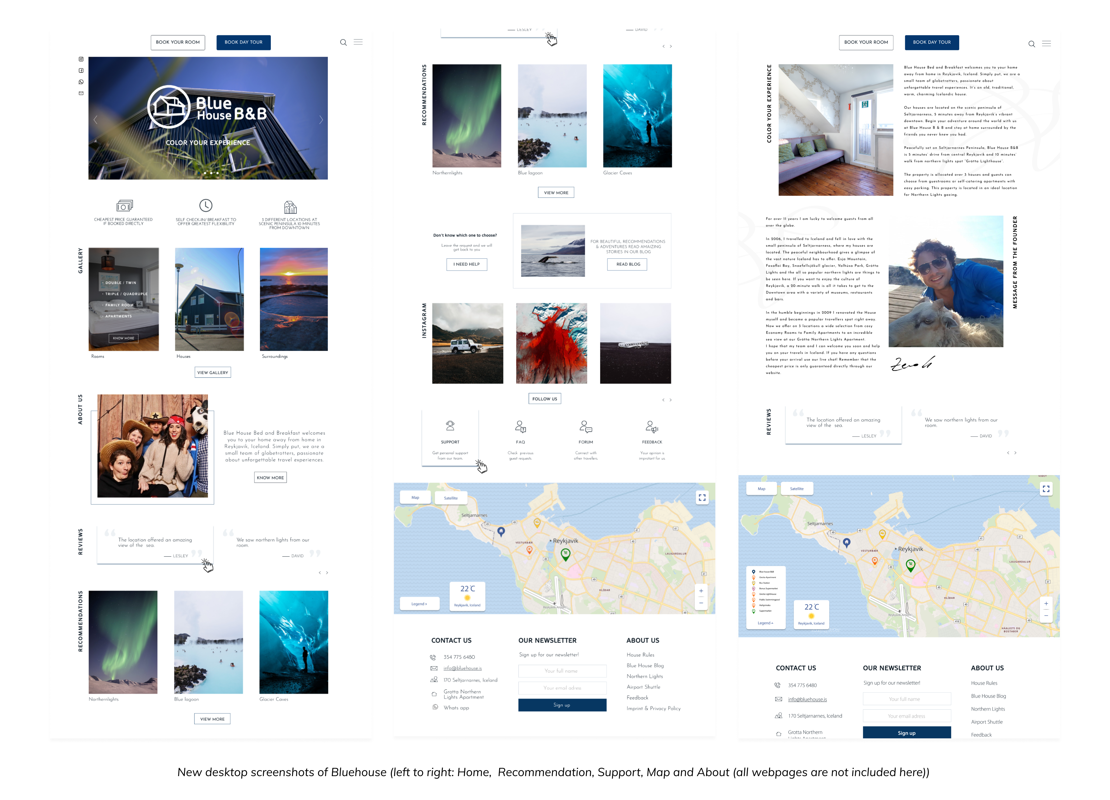
Blue House provides customers home away from home experiences in Reykjavik, Iceland. Simply putting, they are a small team of globetrotters, passionate about unforgettable travel experiences. It’s an old, traditional, warm, charming Icelandic house.
Project Overview
As the only UI/UX designer in the startup, this was one of my first projects for Bluehouse. Bluehouse has a website where they
showcase the rooms and services they provide to travelers. Also, they have a blog where users can share their stories. My objective
was to redesign both the website and give a minimal travel look that will make the users fall in love with not only the website but
also both Iceland and Bluehouse.
As a designer, I had to create a high fidelity prototype that:
→ Communicates with travelers why they should choose Bluehouse over other places.
→ Change the website design to give a minimal traveler look also keeping the old branding style.
→ Make the blog design similar to the main Bluehouse website, so the blog seems as the part of the main website,
as they are connected.

Problem: Why a redesign?
From the research I did and from the founder’s explanation, the current website has the following problems:
→ Users do not understand the value and the point of the website.
→ Users are continuously confused and frustrated as they navigate the site.
→ Users have difficulty booking trips.
→ The website is not accessible.
→ The Website is outdated and the website needed a clean and minimal look that would represent Iceland and Bluehouse.
I focused my redesign efforts on the global navigation and the pages needed to accomplish the primary goals of navigating
through the site and booking a trip. I chose to focus on the desktop versions as my research showed us that is the primary
device where booking takes place. Later, to make it repsposnive, I also designed for smaller screens.
Look and Feel

Iconography: 3 different types
Iconography is crucial to BlueHouse's branding. I want my design to be accessible. The icons play a major role in making a product
or website accesible. Also, the challenge was to maintain the previous brand identity and have a minimal icons that will give the
look and feel we wanted for a travel website. Through many icon explorations, the Marketing Manager and I chose to minimal border icons.
The icons are rectangular (to an extent) and matches with the overal minimal style of the website.
Containing illustrations in rectangle, detailing the same border width, and referencing the style guide's color palette contributed
to visual consistency throughout the website.
These icons are for the main page. Since we were not refreshing the brand and had to use some older icons, we needed icons that matches them. These icons matched the previous icon set, gives the minimal aesthetic that we had in mind. The first three icons that you see here are the ones that was strongly advised by the founder to be reused.

These icons are for the sub pages and hamburger menu. In the previous design, there were only labels without icons. As my main goal is to make the site accessible, I needed the icons that are common and also they are minimal. Also, these icons matched the first icon set, gives the minimal aesthetic that we had in mind.

You might be surprised here as you see they don’t match withthe previous icons. These icons are used in the maps. I wanted the icons to be vibrant and cleary visible in the map. In addition, they should also match the icelandic and bluehouse vibe. Thus, the icons are made of the common location icon and the particular places that the location belongs to.

Geographical Map
The map is one of the final interactive components on the site. In the previous site, the map has legend section that covers a whole lot of space in the map and the icons are not very distinguishable.

My feedback to my project manager was that the legend section was too heavy on the map and the icons were very hard to be distinguished. I also noticed that it caused visible accessibility issues. I redesigned the map with a new legend style and also showing the weather. To further increase visibility of pins, I redesigned them so that they can be easily distinguished.

Design Validation
Feedback and discussion with travellers who are used to booking online. Consider additional ways to make the “tribe” concept clearer to
users. Also consider about page and team photos/about stripe on homepage to continue building trust with users.
Discuss possible trip itinerary customization options.
Additionally, in a nutshell, conduct full heuristic review, discuss findings with client, full IA redesign
(sitemap/user flows/new low-fidelity responsive prototype), additional usability testing including mobile, further developed design
system, conversations with developer/development team discussing client/user needs and SEO/accessibility concerns. Build, additional
usability testing, launch, and post-launch modifications as needed.
Final Thoughts
Overall I think my design will be very successful because of all the tests we did and I look forward to seeing what becomes of it.
A big thank you to the founder at BlueHouse for allowing me to redesign their website. It helped me to grow not only as a designer but
as a team member and a leader as well.
Looking at the results of our tests, we did manage to help solve several problems for our travelers. The general attitudes toward the
redesigned website, as well as the speed and ease with which test participants had in completing their room booking task, conveyed
a sense of trust greater than the air of suspicion that loomed over the very first usability tests on the existing website.
